Using the British Museum as our research setting, PathMuse explores how visitors could collect exhibitions and objects, form a personal route, find guidance through physical touchpoints, and keep a record of their visit.
My contribution
I proposed the “Shopping Cart for Culture” concept, refined the spatial map layers used for route design, and designed, built and iterated physical touchpoint prototypes.
I also contributed to the early visual direction, with elements of my early design work carried through into the team’s interface. For the concept film, I wrote the script, developed the storyboard and produced the section introducing the museum context, the wayfinding problem and the PathMuse concept.
Team interface prototype · Startup screen
Project Concept Film
Concept film · Team wayfinding proposal
The film connects the visit through interface and scenario demonstrations, with selected reference footage.
01
Field Research & Design Opportunities
Where does finding a gallery stop being enough?
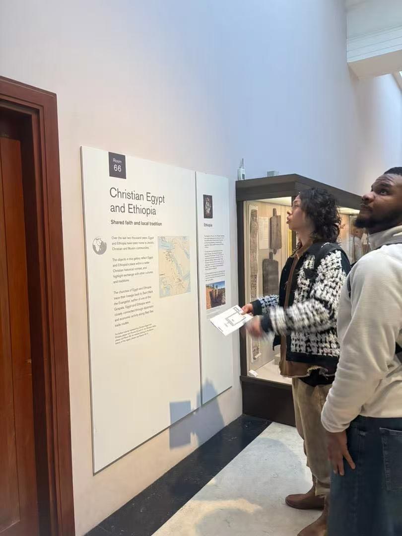
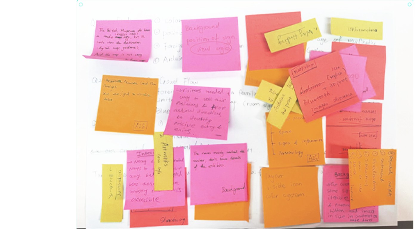
Museum observation, visitor shadowing tasks, map and signage analysis, six interviews with visitors unfamiliar with the museum, and workshop synthesis.
Click an image to view it larger
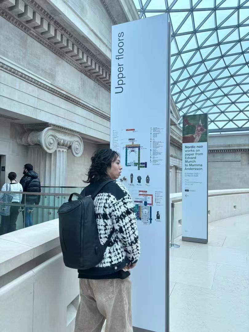
↗Following a destination-search task↗Checking direction in the Great Court
A room number does not identify an object
In the Egyptian Cat search task, an online location reference did not lead to the expected object. Gallery-level directions left the specific display uncertain.
Design response: make selected objects and gallery references visible within the route.
Direction needs confirming along the way
Shadowing recorded hesitation where room-number signs were discontinuous or hard to see. Interviews also raised the need for more maps and clearer cues.
Design response: combine digital guidance with recognisable landmarks and known touchpoints.
A personal route starts with a choice
Interviews described different visit priorities, language needs and time constraints.
Design response: let visitors collect what they want to see; the visit record is my concept response to remembering that journey.
Shadowing tasks included finding an Egyptian Cat object and a restroom.
02
From Selection to Visit Record
Turn a list of things to see into a journey worth keeping.
I proposed “Shopping Cart for Culture”: visitors collect exhibitions and objects they want to see, then turn the list into a personal route. At the end, they review their exploration and photographs.
↗Workshop synthesis · The cultural shopping-cart idea
01Select / Collect
02Personal route
03Digital guidance
04On-site confirmation
05Visit record
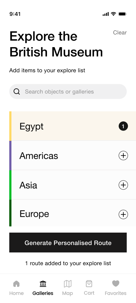
Team interface prototype
Click an image to view it larger
01 · Choose what to see
Add galleries of interest to the visit list, then generate a personal route.
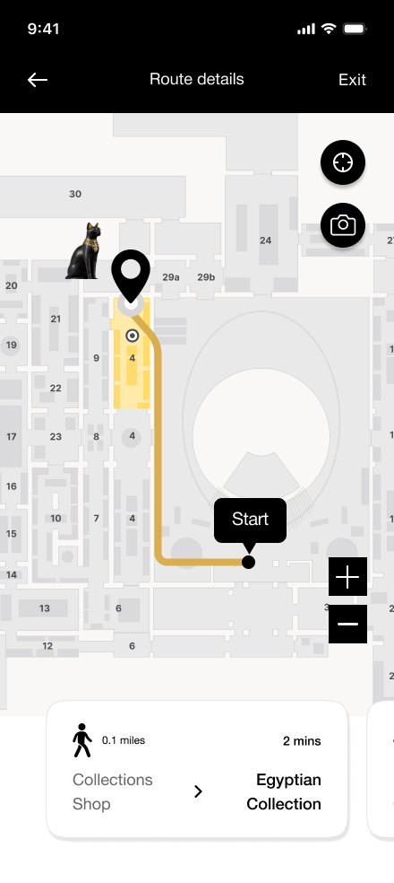
02 · Follow a personal route
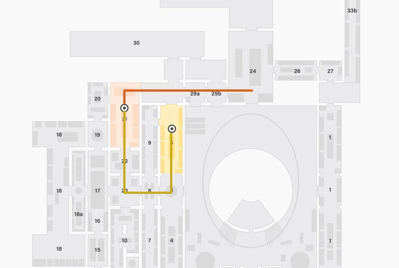
The map links the starting point, selected gallery and landmark cues.
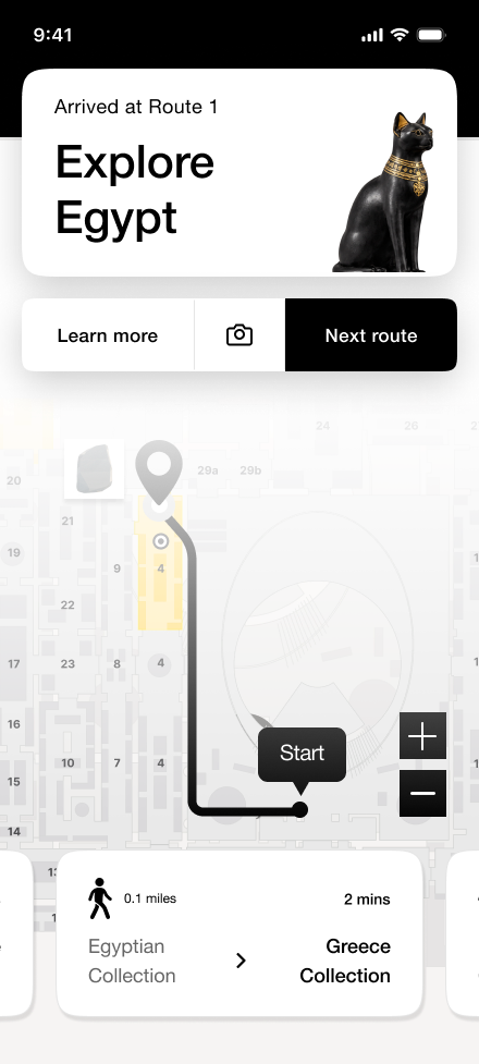
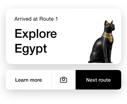
03 · Explore the gallery
The arrival cue brings together gallery identification, more information, photography and the next stop.
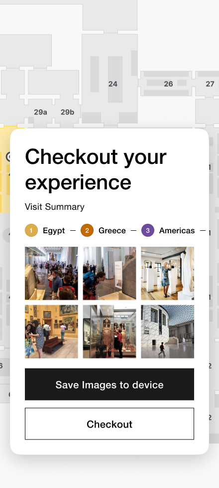
End of the journey
A Record of the Visit
The visit summary brings together the gallery sequence and photographs, with an option to save them as a record of the visit.
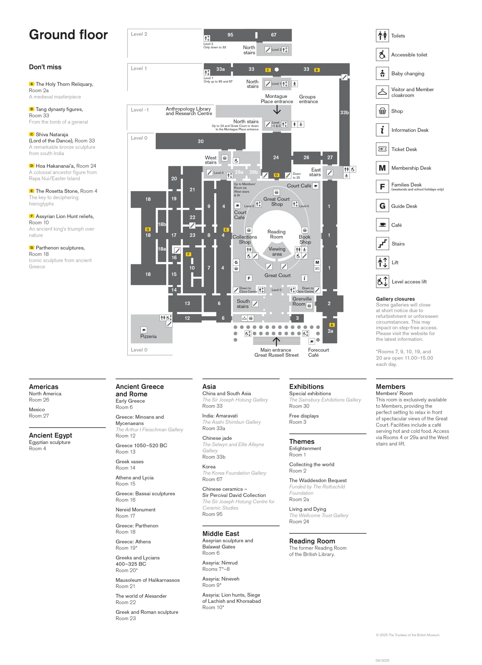
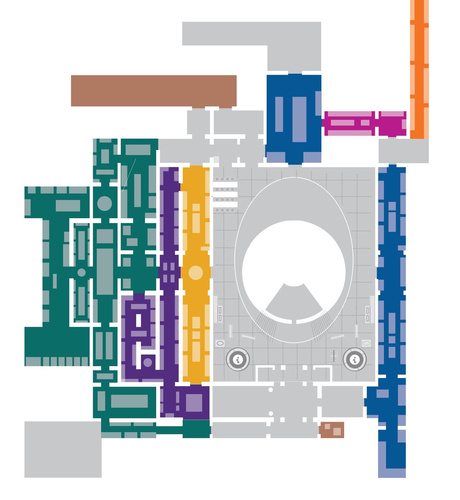
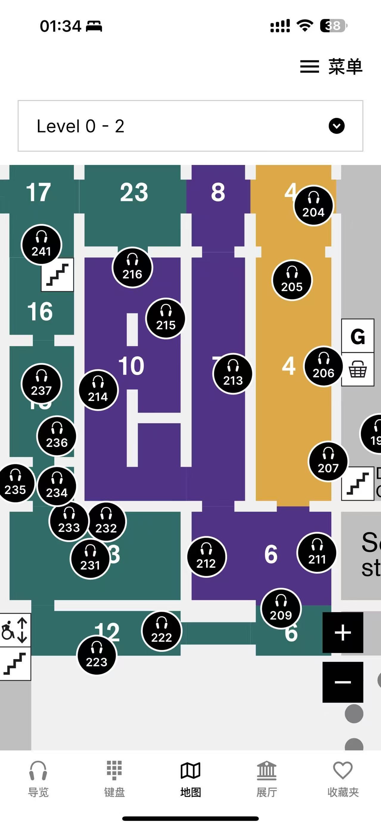
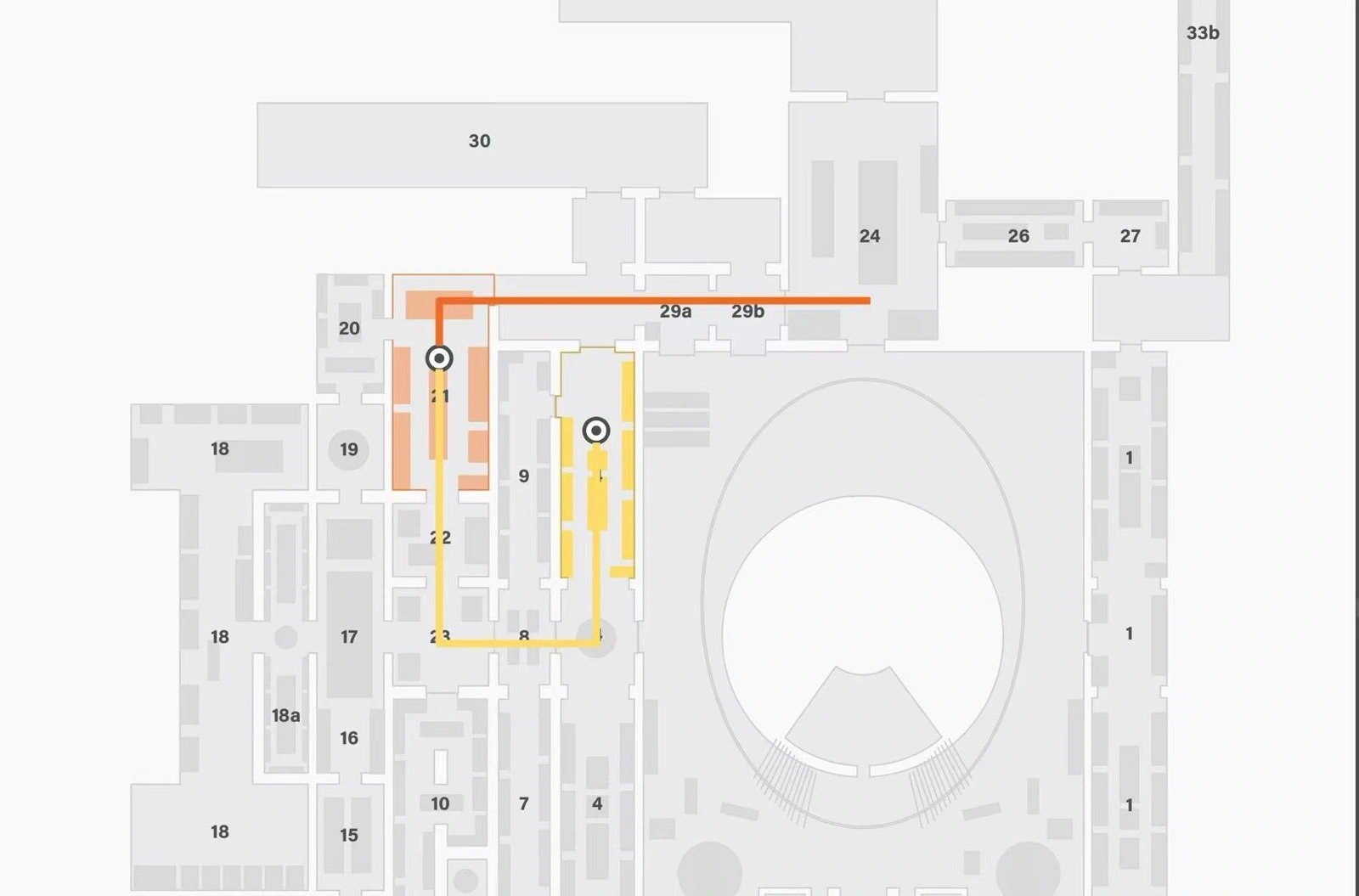
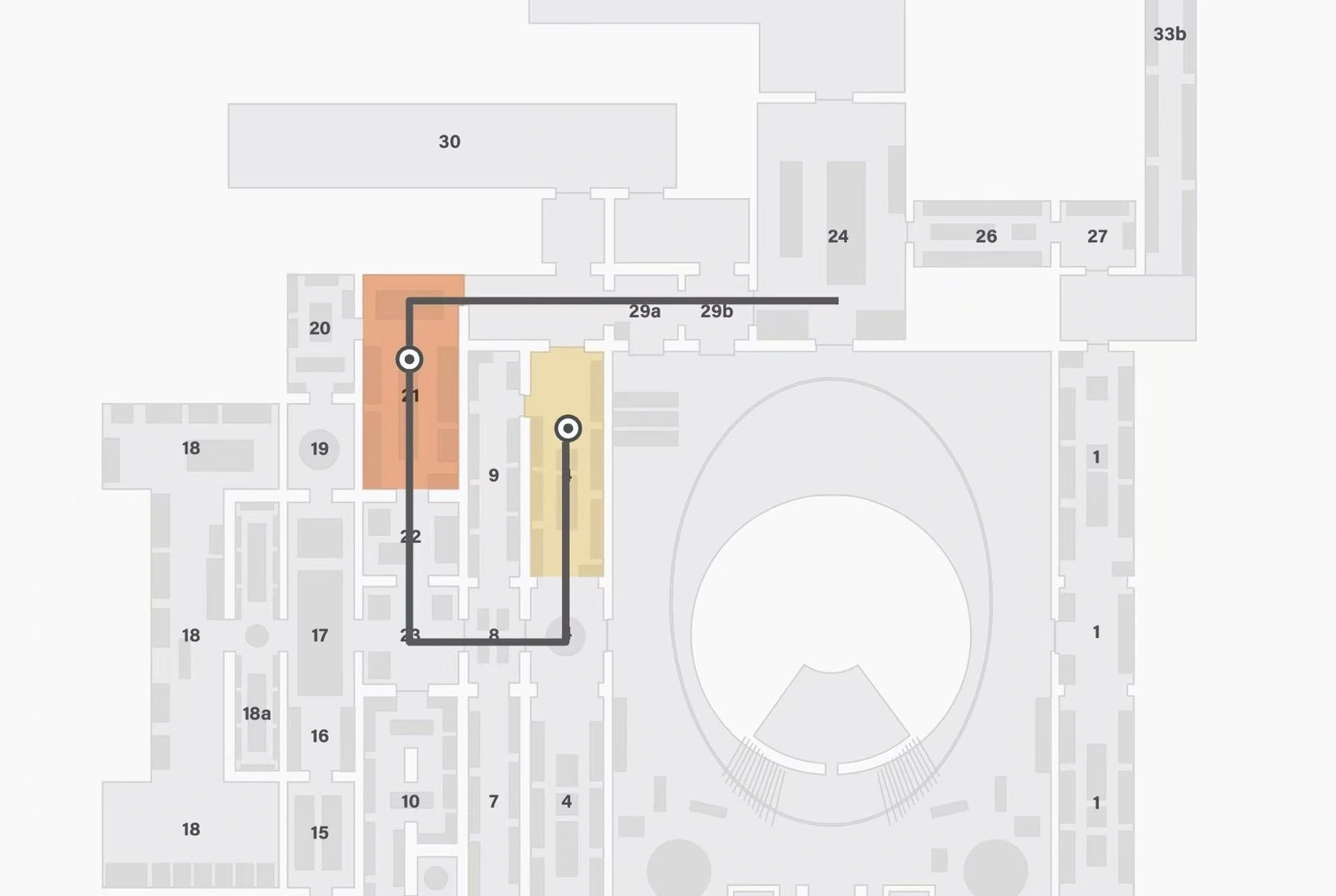
Drawing on the public floor plan and location references, I created a more detailed, editable spatial layer showing gallery areas and approximate display-case positions. The team then used this version as the basis for further map updates, route design and gallery-highlighting exploration.
Click an image to view it larger
↗Reference map · Public museum floor plan↗Reconstructed design layer · Estimated positions
The public floor plan provides the overall layout; the existing guide provides object-location references. I used them to refine the editable design layer, retaining the estimated nature of display positions.
Exploring Route Readability
The team compared the same gallery colour, a darker tone from the same colour family, and neutral black. I supported the comparison by examining whether the route remained distinguishable while relating to the selected exhibition.
Click an image to view it larger
↗A · Darker tone from the same colour family↗B · Same gallery colour↗C · Neutral black
Feedback from this exploratory comparison favoured the darker shade within the gallery’s colour family. It retained the link to the gallery while making the route easier to distinguish. This informed further design exploration rather than validating a general result.
Methods and scope (n=1)
One participant compared A (darker shade), B (same gallery colour) and C (neutral black), then followed a simulated route on campus on 17 April 2026.
04
Connecting Digital Guidance with Physical Landmarks
How can a visitor connect a screen direction with the place in front of them?
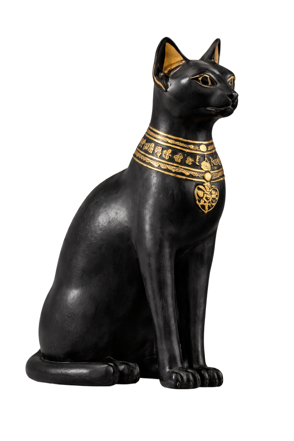
Egyptian Cat · A recognisable gallery cue
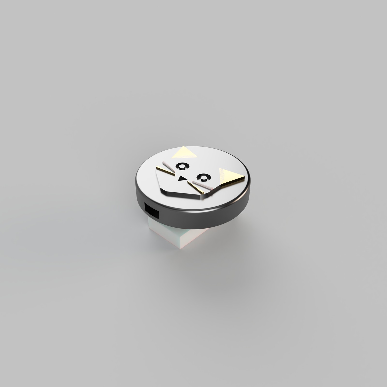
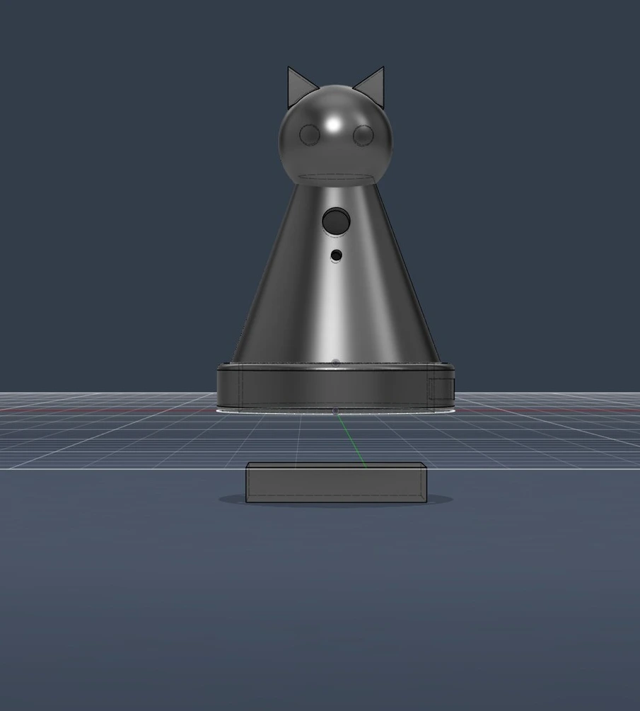
The interface uses cat imagery to identify the Egyptian gallery, while the physical touchpoint explores a related form as an on-site cue.
Click an image to view it larger
↗Cat visual cue · Team interface material↗Arrival cue · Interface detail↗Cat enclosure · My design render
Moai Landmark and NFC Marker
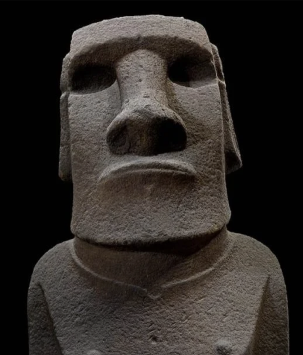
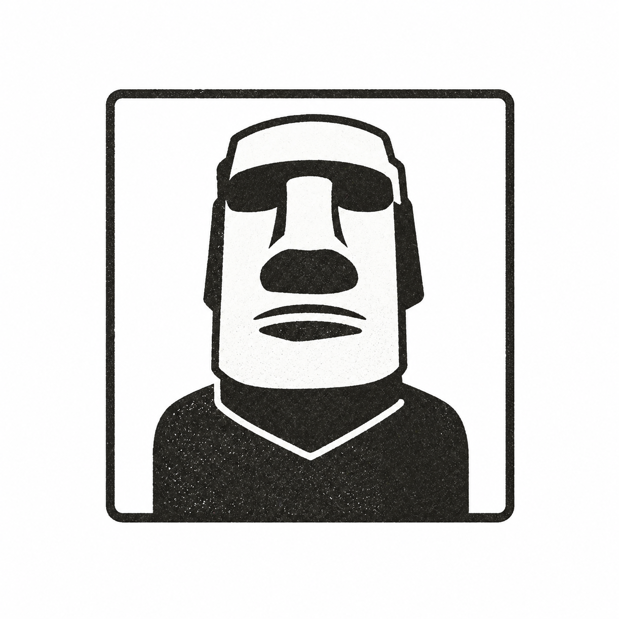
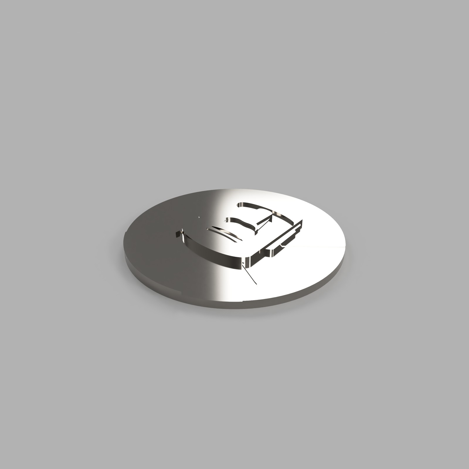
I used the Moai form to develop a slim NFC marker, exploring a recognisable physical cue at a known location.
Click an image to view it larger
↗Reference object · Moai↗Moai landmark graphic · Team map cue↗NFC marker · My design render
01 / ESP32
A container for proximity feedback
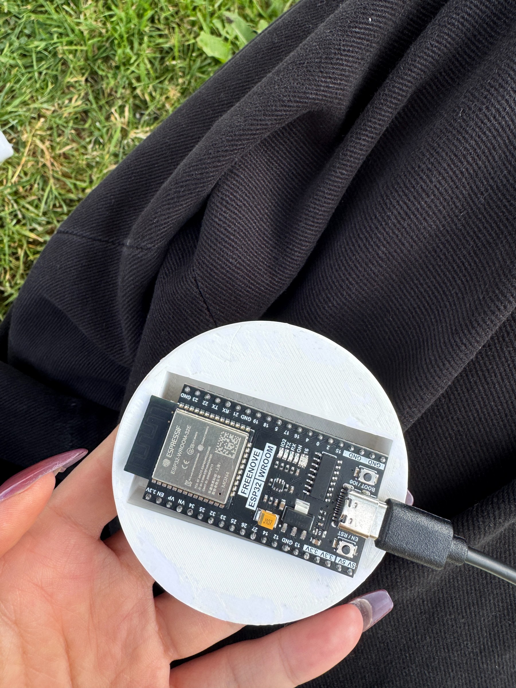
A deeper enclosure accommodates the board and access points to explore relative proximity and distance feedback.
02 / NFC
A thin marker at a known position
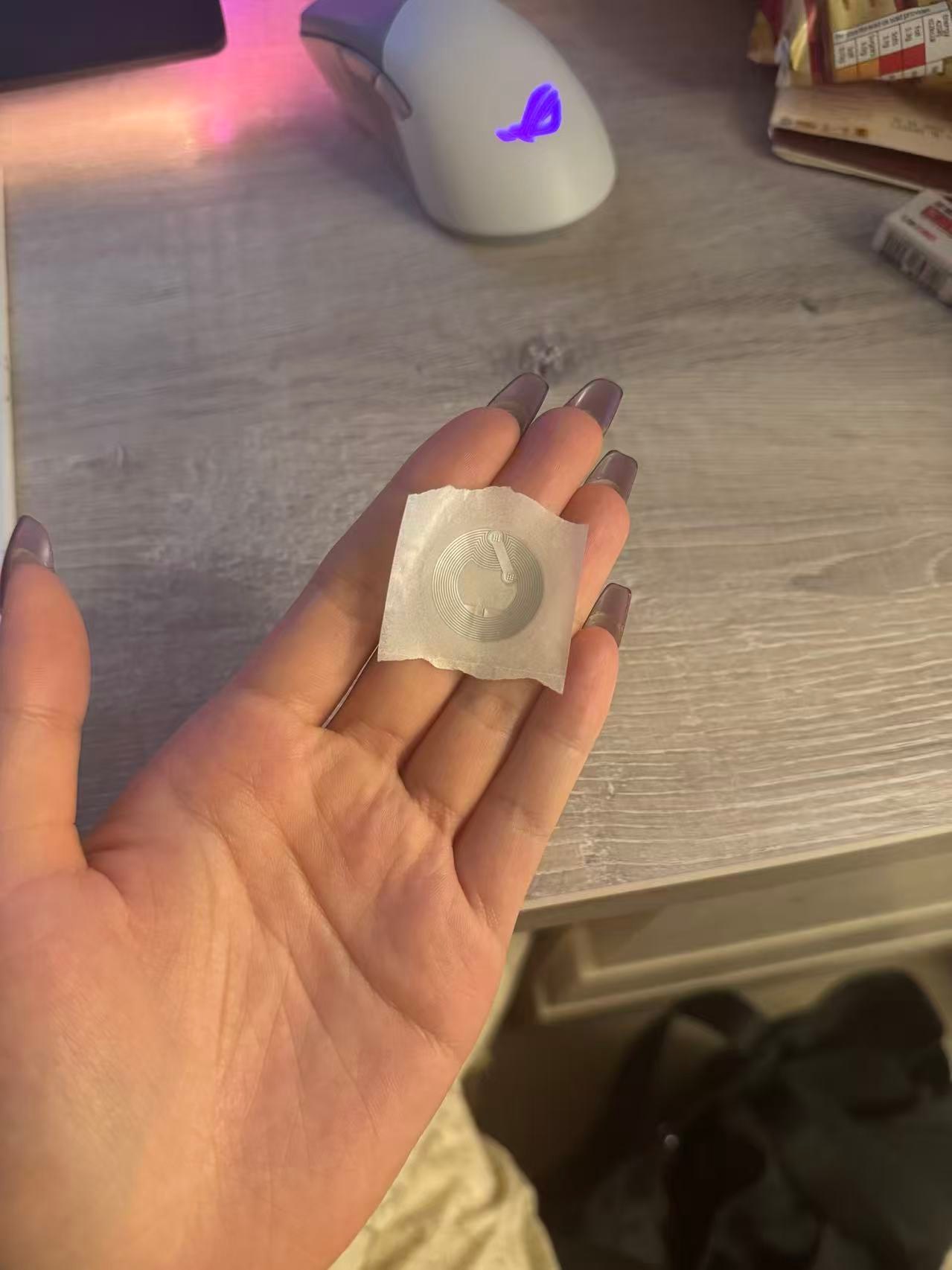
A thin NFC tag can sit behind the marker. Tapping a known point explores location confirmation and a connection to gallery information.
Simplify the form to make room for hardware and fabrication
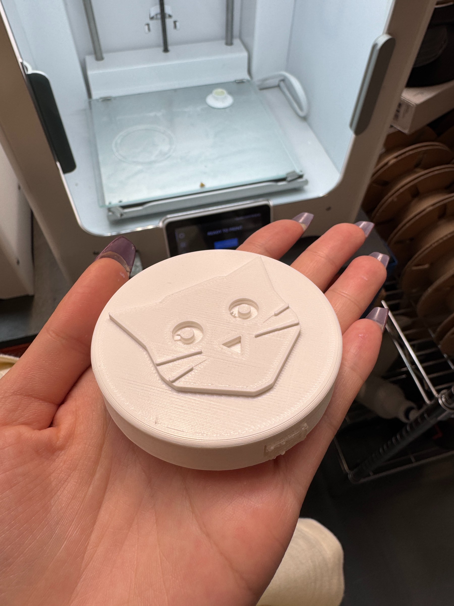
I moved from a complete cat figure to a flatter cat-head enclosure. This reduced size and material use while leaving room for the board, USB access and wall thickness.
Click an image to view it larger
↗Earlier full cat form · Modelling screenshot↗Simplified cat-head form · Physical prototype
The PLA prints provide physical evidence of form and board fitting. On-site recognition, material durability and public mounting conditions still need testing.
05
Evaluation & Next Steps
What the evidence supports, and what comes next.
Explored in this project
Field research informed object finding and repeated direction cues.
The exploratory route comparison informed colour separation and destination association.
Printed samples provide physical evidence of form and assembly; on-site recognition and long-term use still need testing.
Team interfaces and the concept film explain the intended journey from selection to review.
Next to validate
Run complete visitor tasks inside the museum.
Further integrate interface, physical cues, route guidance and visit records.
Test with more visitors and a wider range of language, access and time needs.
Evaluate mounting, materials and use conditions in public spaces.
For me, the key lesson was to make each part of the journey legible: what to choose, where to go, how to recognise the place, and what to remember afterwards. The next step is to test these parts together through real visitor tasks.